
The aesthetic of the 70s and 80s is back in a big way, and nothing captures that nostalgic vibe quite like a retro 3D stacked text effect. While there are many ways to create depth in Adobe Illustrator, the Blend Tool remains the most versatile and non-destructive method for creating smooth, flowing extrusions. This technique is perfect for posters, t-shirt designs, and branding projects that need a touch of vintage flair.
1. Preparing Your Typography
The secret to a great retro effect starts with the right typeface. For a 70s look, choose a thick, rounded serif; for an 80s “synthwave” vibe, go for a bold, italicized sans-serif.
- Type your text: Use the Type Tool (T) and choose a font like Editorial New or Cooper Black.
- Convert to Outlines: While not strictly necessary, converting your text to outlines (Cmd/Ctrl + Shift + O) gives you more control over individual letter placements.
- Apply your colors: Choose a vibrant palette. Retro designs often use a “warm to cool” transition or a high-contrast combination like cream and burnt orange.
2. Setting Up the Blend Layers
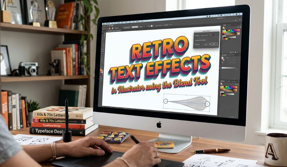
To create the 3D effect, you need a “Start” object and an “End” object.
- Duplicate the text: Select your text and press Cmd/Ctrl + C, then Cmd/Ctrl + B (Paste in Back).
- Scale and Position: Take the back copy and move it diagonally (e.g., down and to the right). Scale it down slightly if you want a perspective effect, or keep it the same size for a classic parallel extrusion.
- Change the Color: Change the color of the back copy to a darker shade or a different hue in your palette to define the “depth” of the effect.
3. Executing the Blend
This is where the magic happens. The Blend Tool will bridge the gap between your two text layers with a series of intermediate steps.
Configuring Blend Options
Before blending, go to Object > Blend > Blend Options.
- Change the Spacing to Specified Steps.
- Enter a high value (between 100 and 200). This ensures the transition looks like a solid, smooth shape rather than a series of individual copies.
Creating the Blend
- Select both the front and back text objects.
- Go to Object > Blend > Make (or press Cmd/Ctrl + Alt + B).
- You should now see a smooth, 3D-like extrusion connecting your two text layers.
4. Refining the Retro Aesthetic
Once the blend is created, you can still edit it to add that final “pro” touch.
The “Double-Layer” Trick
For a true vintage look, copy your original front text layer and Paste in Front (Cmd/Ctrl + F). Give it a thin stroke and a slightly lighter fill. This creates a “face” for your text that stands out from the 3D extrusion.
Warping the Path
The Blend Tool follows a “spine” (the line between the two objects).
- Use the Direct Selection Tool (A) to grab the back object and move it around. The extrusion will update in real-time.
- You can even use the Anchor Point Tool to curve the spine, creating a “wavy” or “ribbon” text effect that was highly popular in 1970s psychedelic posters.
5. Final Textures and Effects
To move away from the “too clean” digital look, add some grit:
- Grain: Go to Effect > Texture > Grain to add a subtle film-like noise.
- Inner Glow: Apply a subtle Inner Glow to the front layer to give it a slightly printed, tactile feel.
Resources and External Links
To expand your retro design toolkit, check out these essential resources:
- Adobe Illustrator Blend Tool Official Guide: The technical breakdown of all blend modes and options.
- Pangram Pangram Foundry: Excellent source for the “Editorial” fonts used in modern-retro designs.
- RetroSupply Co. Tutorials: Specialized guides on adding authentic vintage textures to your Illustrator vectors.
- Vecteezy Vintage Palettes: A great place to find pre-made 70s and 80s color schemes.