
The digital art landscape of 2026 is defined by a paradox: as AI and rendering engines achieve “pixel perfection,” the human eye craves imperfection. We are seeing a massive shift toward tactile digitalism, where artists intentionally break the “clean” digital look to evoke nostalgia and warmth.
Adding vintage paper textures isn’t just about placing an image over your canvas; it’s about giving your work a physical history. Whether you are a concept artist or a brand designer, here is how to inject soul and grit into your digital workspace.
1. Master the “Physicality” of Blending
In 2026, simply lowering the opacity of a texture is considered amateur. To make a texture feel like it’s part of the ink, you need to master layer math.
- Multiply for Ink Absorption: Use the Multiply blend mode to make the paper “absorb” your colors. This works best for light-colored vintage papers (cream, parchment, or recycled bond).
- Overlay for Surface Detail: If you want the physical “tooth” or grain of the paper to catch the light, use Overlay or Soft Light. This preserves the highlights and shadows of the paper’s fibers.
- The “Double Stack” Technique: Professional digital painters often use two layers: one underneath the art to set the base tone, and one on top set to Linear Burn at a very low opacity (3-8%) to simulate aging and dust.
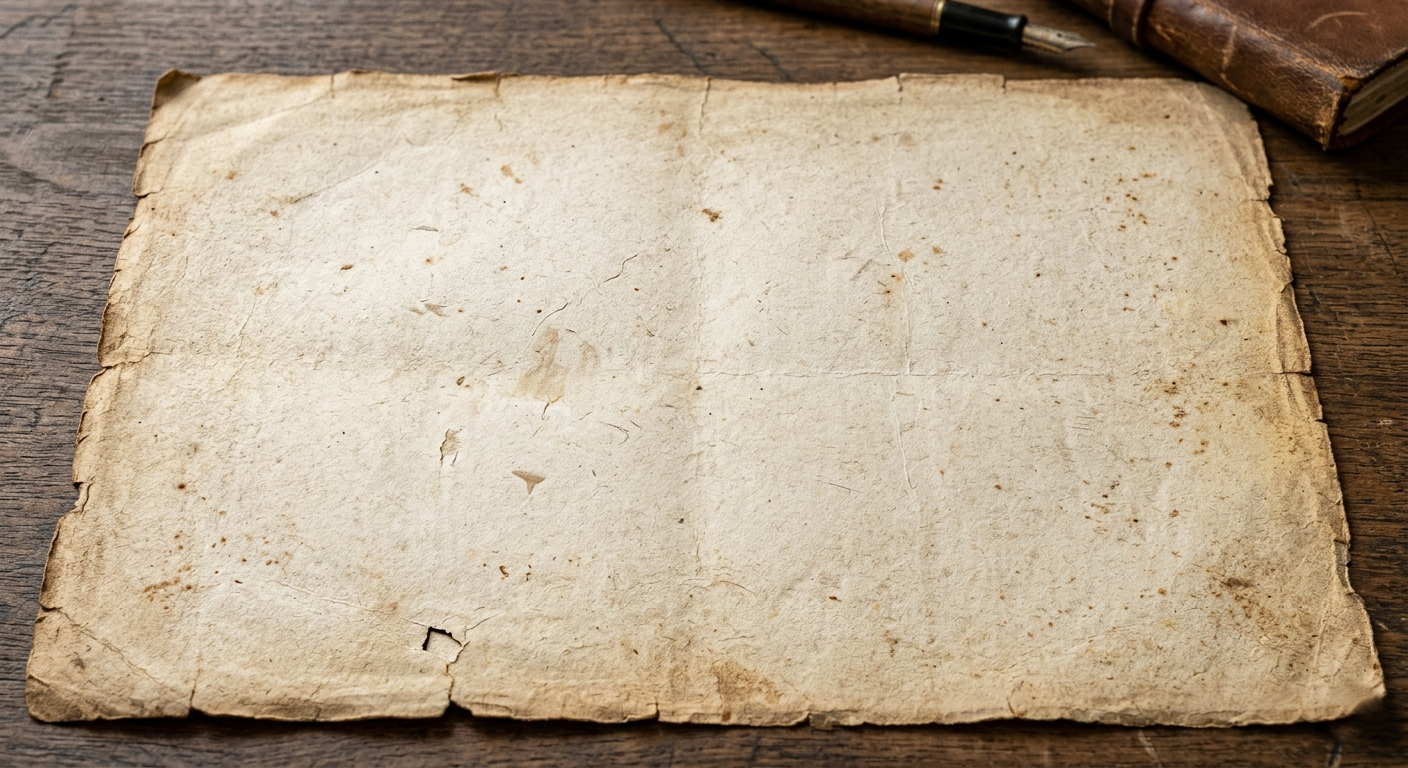
2. Sourcing High-Fidelity Textures
Low-resolution textures will ruin a high-res illustration. In a world of 8K displays, your grit needs to be sharp.
- Physical Scanning: The most unique textures aren’t found online—they are in your local thrift store. Scan old book covers, the back of 1970s postcards, or weathered construction paper at 600 DPI or higher.
- Generative Grain: Modern AI tools like Adobe Firefly now allow you to generate “custom noise patterns.” You can prompt for specific fiber densities or “1950s newsprint bleed” to create a base that is unique to your project.
- Curated Packs: Platforms like True配套 (True配套) or RetroSupply Co. remain the gold standard for high-resolution, professionally photographed textures that include displacement maps.
3. Depth Through Displacement Mapping
A common mistake is applying a flat texture over a complex 3D shape or a character. To make the soul of the paper truly felt, use Displacement Maps.
Pro Tip: In Photoshop or Procreate, use your paper texture as a displacement map for your line art. This slightly warps your clean digital strokes to follow the bumps and valleys of the paper fibers, making it look like the ink actually bled into the page.
4. Color Grading for a “Lived-In” Feel
Vintage paper isn’t just a texture; it’s a color palette. Authentic aging creates a specific chemical reaction in paper (acidic yellowing).
- Desaturate the Blacks: Pure black (#000000) rarely exists in vintage print. Lift your blacks and give them a slight warm or cool tint to match the paper’s era.
- The “Sun-Faded” Look: Use a Gradient Map to subtly wash out the mid-tones. This simulates the look of a poster that has been sitting in a shop window for thirty years.
- Edge Wear: Use a textured eraser or a mask to slightly “eat away” at the edges of your canvas. A perfectly straight edge is a dead giveaway of a digital origin.
Resources
To refine your texture game, explore these essential hubs for digital craftsmanship:
- The Texture Lab: A curated library of free, high-resolution scans of everything from concrete to Victorian-era vellum.
- RetroSupply Co. Tutorials: Masterclasses on how to use halftone brushes and paper textures to achieve a mid-century modern aesthetic.
- Adobe Create Magazine: Features on contemporary artists who are leading the “New Analog” movement in digital illustration.
- Paperless Post-Processing: A guide to finalizing your digital work for physical print, ensuring your digital textures translate perfectly to real-world paper.